
Introduction
In 2026, having a website is no longer enough.
Even “good-looking” websites are everywhere.
So what actually makes a website feel professional?
It’s not just colors.
It’s not just animations.
And it’s definitely not about adding more sections.
👉 A professional website is defined by clarity, structure, and execution.
Let’s break down what truly separates an average website from one that feels refined, credible, and high-quality.
🎯 1. Clarity Over Creativity
One of the biggest mistakes in modern web design is overcomplicating things.
A professional website:
- communicates instantly
- avoids confusion
- prioritizes clarity over cleverness
✅ What this means:
- Clear headline (no vague slogans)
- Simple messaging
- Easy-to-understand layout
👉 If users have to “figure out” what you do, the design has already failed.
🎨 2. Consistent Visual System
Professional websites feel consistent, not random.
Everything follows a system:
- colors
- typography
- spacing
- buttons
💡 Key Elements:
- 2–3 primary colors (not 6–7)
- consistent font pairing
- uniform button styles
- predictable spacing
👉 Consistency creates trust.
📐 3. Proper Spacing & Layout
Spacing is one of the most underrated aspects of design.
Amateur websites:
- feel crowded
- lack breathing space
- look unbalanced
Professional websites:
- use whitespace intentionally
- align elements properly
- create visual hierarchy
👉 Good spacing = premium feel.

⚡ 4. Fast and Smooth Performance
A slow website instantly feels unprofessional.
In 2026, users expect:
- fast loading
- smooth scrolling
- no lag
🚫 Common issues:
- heavy images
- too many animations
- unoptimized builds
👉 Performance is part of design—not separate from it.
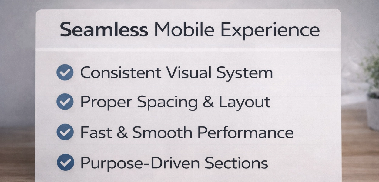
📱 5. Seamless Mobile Experience
More than half of users are on mobile.
A professional website:
- adapts perfectly to all screen sizes
- maintains readability
- keeps interactions easy
✅ Must-have:
- proper font scaling
- clean stacking
- clickable buttons
👉 If mobile feels broken, the entire site feels unprofessional.
🧭 6. Clear Structure & Flow
A professional website guides users.
It doesn’t overwhelm them.
Typical high-quality flow:
- Clear introduction
- Trust signals
- Services or offerings
- Why choose you
- Call-to-action
👉 Structure creates direction—and direction creates conversions.
🧩 7. Purpose-Driven Sections
Every section should have a role.
Not just “fill space.”
❌ Weak sections:
- generic text
- unnecessary visuals
- no clear message
✅ Strong sections:
- solve a problem
- answer a question
- move the user forward
👉 Intentional design always looks more professional.
🔤 8. Strong Typography Choices
Typography plays a huge role in perception.
Professional websites use:
- clean, readable fonts
- proper hierarchy (H1, H2, body)
- balanced font sizes
💡 Avoid:
- too many font styles
- poor readability
- inconsistent sizes
👉 Typography = silent branding.
🧠 9. Subtle, Not Excessive Effects
Modern design is about restraint.
❌ Overuse:
- heavy animations
- flashy transitions
- unnecessary movement
✅ Professional approach:
- subtle hover effects
- smooth transitions
- minimal motion
👉 Less distraction = more focus.

📞 10. Clear and Confident CTAs
Professional websites make it obvious what to do next.
Good CTAs:
- are visible
- are repeated strategically
- use clear language
Examples:
- “Get Started”
- “View Work”
- “Request a Quote”
👉 If users don’t know what to do, they won’t act.
⚖️ The Real Difference
❌ Average Website:
- looks okay
- lacks structure
- feels inconsistent
✅ Professional Website:
- feels intentional
- communicates clearly
- builds trust instantly
- guides users naturally
🏁 Final Thoughts
A professional website in 2026 is not about trends.
It’s about:
- clarity
- consistency
- performance
- usability
👉 When these elements come together, your website doesn’t just look good—it feels right.
And that feeling is what builds trust, credibility, and results.